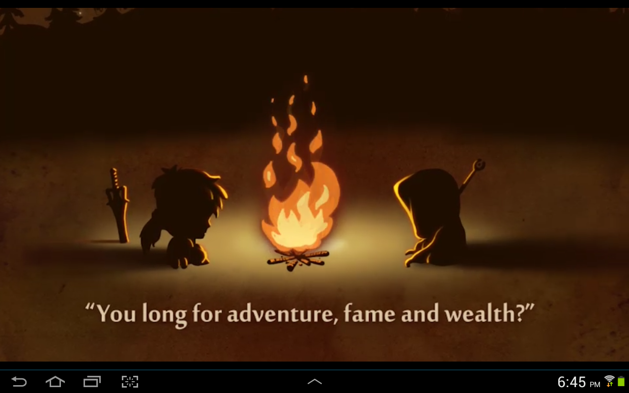
The “League of Heroes” is a simple RPG available both in the Android Play store and Apple App Store. I really enjoyed the bright, playful graphics and the smooth game play, but there were some drawbacks to this game.
Welcome to the village of Froggnest
The hero of the game is asked to undertake a quest to rid the small village of Froggnest of the scourge of evil creatures that presumably want to destroy the inhabitants. These inhabitants seem to consist of a Captain, an armorer, potion mistress, town troll, a trainer, and an elderly grandmother. Most of these have obvious functions, such as the armorer and potion mistress, who both sell valuable items that are useful for completing quests. The Captain gives the player missions and individual quests, and the trainer provides certain capabilities for a price—such as increased hardiness or stamina. The town troll is the social feature of the village, and the grandmother provides small side quests for a reward, such as gathering sticks for her while the hero is on other larger quests.
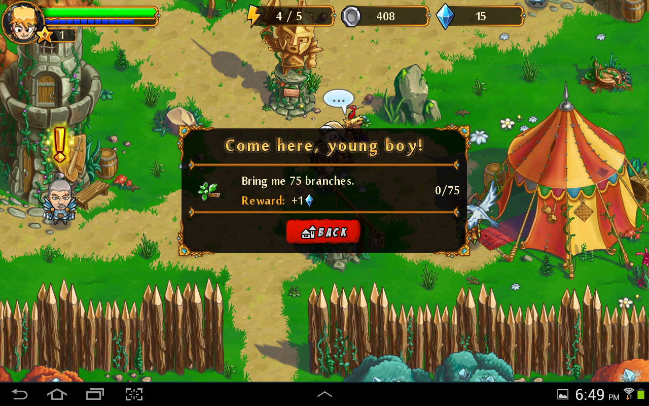
The Grandmother’s Quest
Each time the hero leaves the village, he is given a choice for his quest. There is exploration, which allows him to continue to defeat ordinary monsters, the daily quest, which is pretty self explanatory, and the boss level. I like this layout because the player can choose when to face the boss level. If the hero has gone too long without facing a boss, the game will alert him that he can continue to accumulate coins and jewels, but that his XP will not increase until he has finished the boss level.
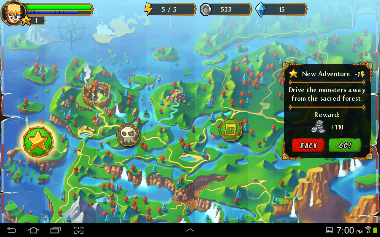
Choose your own adventure…
I like the smoothness of this little game and the ease with which the player can become immersed in the world. The graphics are bright and pretty. Quests are simple enough to be played in roughly three or four minutes—which is perfect for the adult player who just wants to take a brief break from work or homework.
There is a nice variety of monsters, and while most of the terrain looks similar, it is not exactly the same. This helps keep it from being boring. Also there are lots of little barrels and jugs scattered throughout each level that can be smashed to reveal the contents—coins, usually, but occasionally nothing. Once a level has been cleared of monsters, the hero is given the option to go straight home to the village, or stick around and search for more treasure.
Where the game falls short is the controls. The main character is controlled with a touch compass in the bottom left corner of the screen. Moving the compass determines which way he goes. The bottom right corner is the action button. While the player is exploring, this is a sword. At other times it can be used to interact (or “talk”) with other characters, or perform other actions.
I realize that the game has to work with the soft, onscreen buttons on most tablets and smart phones, but it makes the player work very hard to keep his character headed in the right direction. I’ve been defeated during several levels because I was swinging my sword away from the monsters that were attacking me, and couldn’t get turned back around in time.
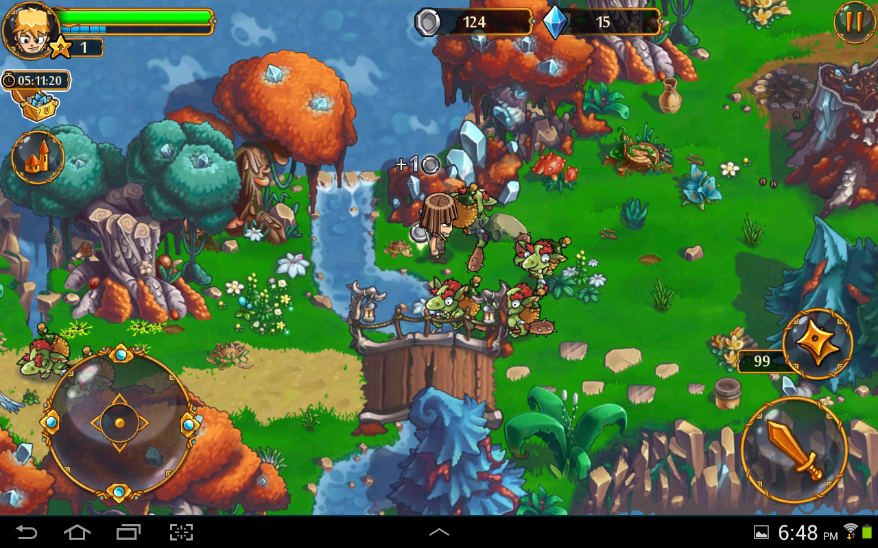
Here there be monsters
Overall, this is a bright, cute, fun game to idle away some hours, but it is easy to get frustrated over the difficulty of control due to a lack of physical buttons. I give the game three out of four Death Stars.